How I Did It Part 1
How I Did It, Part 1

The Art Of Reading
I'd been thinking I wanted to teach more.
I'd taught before. It was grinding. Because I get into it. And I want my students to come out of the experience as better photographers than they went into it. It's also time consuming. You have to develop a lot of materials.
I thought using informal blog posts and teaching very small lessons one at a time might be less draining. I think it will still fulfill my urge to help someone get better and I can do it as I can do it. Though I'm still going to look into maybe working with Cameragraphics to teach a workshop or two. Anyway because it's a blog and it's on my wedding website I have to start with at least a decent picture. This is what we are trying to do.
Oh wait before we really get into this I need to give you my first lesson. Which you will read over and over and over if you follow the blog. If you are getting the picture you want stop giving a rats rear end about what other people think of it or feel about it. The model, your partner, your other photographer friends, your teachers and mentors; forget all their feelings. The truth is there are so many great photographers that no matter how good you are you may never get noticed. So make your art for you. Take your joy and your enrichment and your satisfaction from making your vision real.
I call this series The Art of Reading. A couple of weeks ago I'd decided that I was going to take the plunge and get back into selling certain pieces as art. Most of these will be limited editions (5 copies), some will be single prints. My first show is going to focus on the human form lit and/or backdroped in interesting ways/situations.
As I was coming down the stairs to tell Helen I saw our kiddo sitting on the floor entranced in a book. She wasn't aware of anything else going on and that's when I struck on this image. The book literally seemed to be shining on her.
Now as part of the idea of creating an art show I wanted to do a series of portraits in colored or multicolored lights. I love the feel of those kinds of pictures and I can do them pretty well so I decided to mix this idea with the book idea to make it more interesting.
So my second lesson for you is be deliberate in creating pictures. There are photographers who just fiddle around and end up where they wanted to be but I'd suspect most of us are unsatisfied in that process. They walk around with their camera and find great things. Thats not the way the process works for me. I'm a great believer in making the thing you want. I MAKE my best pictures, they didn't just happen. I think having an idea and making it happen really helps you develop the understanding of your abilities and equipment that makes it easier to accept what you get in professional settings you don't control, like a wedding. Hell even in those settings I walk the venue before I ever take my camera out and decide at some point I'm going to make this picture.
Thats worth highlighting. I never take my camera out without an idea of what I want to achieve.
You'll find that you will grow to a place where you go in to a session with strong ideas but have the fluidity to go where the energy of the session takes you and get the best picture available with the people and equipment you have. My favorite picture from this session isn't the one I planned, it's one that just happened as we worked through possibilities.
So before I did anything I knew I'd use three colors of light. I knew I didn't want the light to overlap but I did want it to fall and separate in interesting ways. I knew I was shooting in the house which is mostly carpet, but I wanted the feel of the picture to make you unaware there was carpet. And I knew I wanted the subject nude so it would fit in with the rest of my series that I was planning in my head. I also knew I didn't want to photoshop very much. I'm super committed to getting the picture I want with my camera with as little help from my computer as possible.
I decided on red and blue because they compliment and if they fall off right they do so to black. I wasn't concerned with getting them to fall off right though if you are actually doing this you might be. That is simply because I've done this more times than I can count. You need to do it, and do it, and do it, and do it, and do it till you are sick to death of it. Then do it a thousand more times.
There is no light, lens, camera, gel or other piece of equipment I have not tested a thousand times in my bag. I can tell you exactly how far the light falls off with each gel and softbox I own. There are lots of "teachers" and "mentors" selling the idea you get on their system and its a shortcut to greatness. That is a load of what horses and cows leave in fields people. Every path to art crosses through long periods of practice.
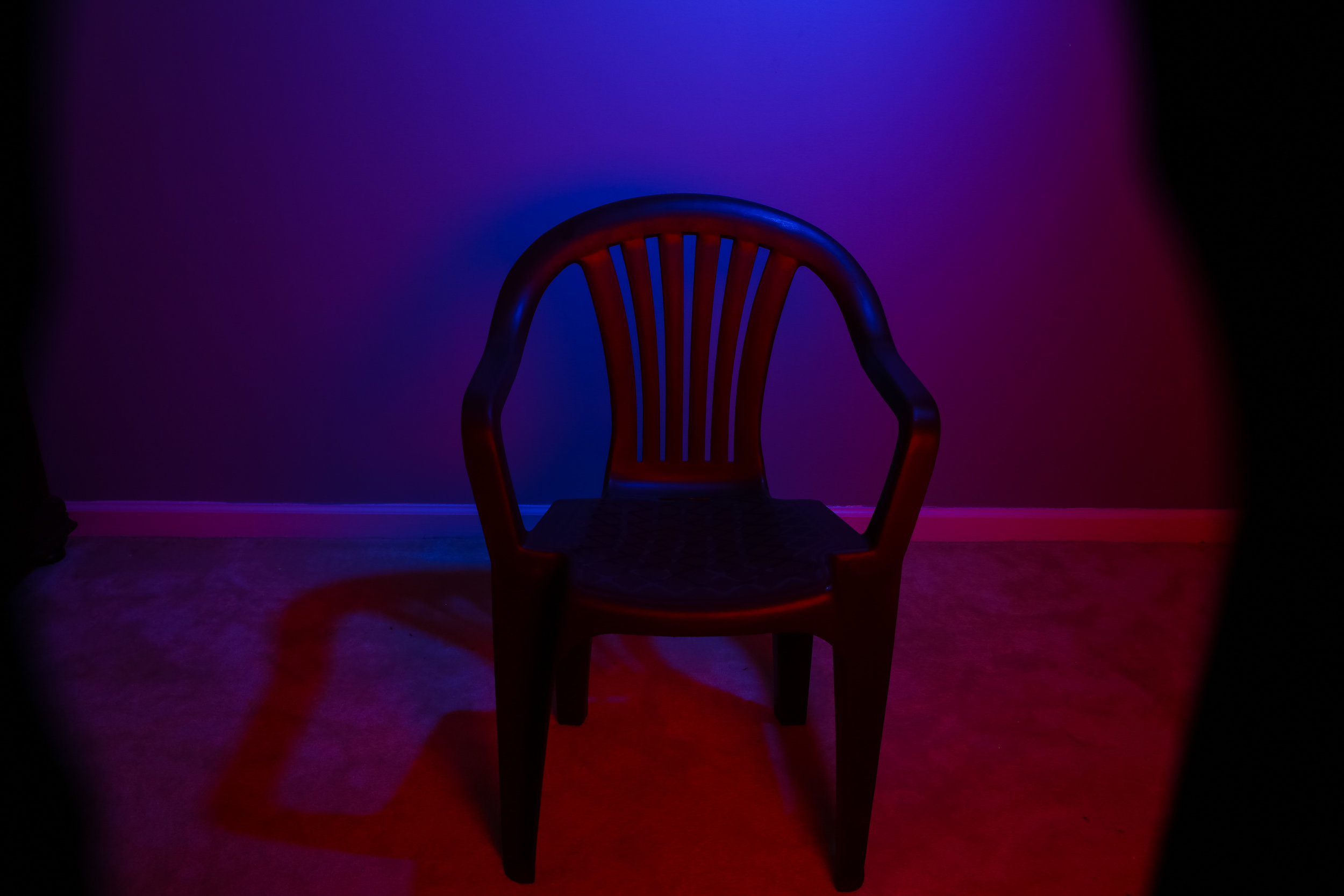
Having picked my colors I decided to put blue in the background and have red light the foreground just a little and the interior of the chair. When you use multiple lights, even if they are the same color and temperature I subscribe to setting up one light first. So I started with the blue.

Step 1
That is the first try. I toyed with it a bit to get it in the right place and intensity. We'll talk about why the placement of the light is critical in a second. This is just a plain old plastic chair with a Profoto B2 on a boom in my living/dining room. It's gelled to blue. I'd normally prescribe using two lights to light your background for an even hue but I wanted to do this with one as most people only have two lights at best and I needed one to furnish the red color.
You can do this with any light as long as it's directional. A bare bulb light wants to go 360 and it's going to bleed onto the edges of the chair too much. Thats useful sometimes but I wanted nice crisp definitions of the light sources here.

Step 2
You'll notice the hotness in the center of the blue light? I wanted that to feel like the moon, cause without two lights this hotspot is tough to get rid of (unless you want to spend $100 or more on a special gel) so i may as well use it to my advantage.
Now the blue is right so let's layer in the red.
Step 3
I started this with the red light in softbox on a pole, you can see it intruding on the right. The light isn't in the right place yet because the red is hitting the wall. Now I need the chair I was actually going to shoot because to set the red light properly I need real weight to the chair.

Step 4

Step 5
The chair has some newsprint which ties into the reading theme nicely. I take my second B2 in the 2x2 softbox and set it on the floor angled up. Thats too low, I'm not getting the blue rim I want (patience reader, you'll see what I mean). Then I set it on a small box. That completely illuminates the chairs interior without bleeding into the wall.
Now I adjust the red and blue lights together so that I don't cast an ugly shadow to the left of the picture (getting the vast majority of the blue falling directly behind the chair). So once the second light comes in you adjust them all to be harmonious. Its another advantage to the B2, if there are two lights on the background (and thats the easier picture guys) then I can adjust them together or separately pretty easily.
The blue light is hitting that top lip of the chair (you'll see why I did that in a minute I think). So the red light is maybe .7 stops higher than the blue to overpower where they meet on the chair.
We are about 10 minutes into the process which is pretty good since I had to move the newsprint chair across the house..

Step 6A

Step 6B

Step 6C
Now the light for inside the book. Thats a little LED panel from Savage that can light up in 300 colors. The purple was two complementary, I would have needed to edit a bunch to produce the kind of punch and contrast I like in my pictures. Ditto with the orange. I went with the green as it's super crip and gives me that punch I was looking for. Then we bring in the subject.
Add 5 minutes to test with the book lights and decide on a color then tune the lights together. But it only takes that long because I have to manually tune the book light, it has no transmitter.

Now we’ve got a picture!
Why is she nude? It's not like I'm revealing anything here. It's because human skin loves the light in a way most cloth doesn't. You will get the most value out of this kind of lighting on bare skin.
Now I want you to take a second and zoom in on the right shoulder. Notice that blue rim light on her shoulder? Thats why the blue is set to fall just a tiny bit into the chair, for that reason. At a proper non web printed resolution that rim light pops her off the chair. Even tho you don't super notice it, it happens. Details are important in artistic photography. Its the details that set the tone. Great details turn a good picture into a great picture.
And this is roughly how it came out of camera, less than two minutes of photoshop. I cleaned up a little light spilling on her right arm and I removed a scar on her forehead.
Now this, in my opinion is a 5 star picture. But the green is too broad here. I should have had her close the book a little to narrow the light. However I kept it because a crop makes it super interesting. Observe.

Close up
In the crop the light spilling on arm gives good dynamic range and gives each color an equal foothold in the picture.
Anyway that's how I did this. The red light gives just enough light that you feel it in the foreground. Everything thats supposed to be blue is still blue. You don't notice the carpet at all, even when light hits it.
One more note. Every book and instructor will scream it into your memory that you never uplight a subject unless you are going for a horror look. And I agree it's typically a bad idea. But every light that actually touches Helen here is an uplight and it works. I think it works because this isn't a picture of her, its a picture of an idea. She's just the prop that illustrates the idea. So remember rules are made to be broken once you have the confidence and ability to do so.
Thats all I got. Enjoy your Sunday and we'll be back on our regular posting schedule until the mood takes me again.

The actual space we worked in.
And so you guys know, this is the actual space we work in.